
The Spectrum Within: Mapping Your Brand's Identity Through Color Psychology
The new year stretches before us, a blank canvas shimmering with possibilities. For creatives and entrepreneurs, it's a time to revisit, refresh, and perhaps even reinvent the visual story of our brands. But before we reach for that proverbial paintbrush, let's embark on a fascinating journey inwards, unearthing the hidden hues that truly define our identity. This is where color psychology steps in, not as a rulebook, but as a vibrant language waiting to be spoken.
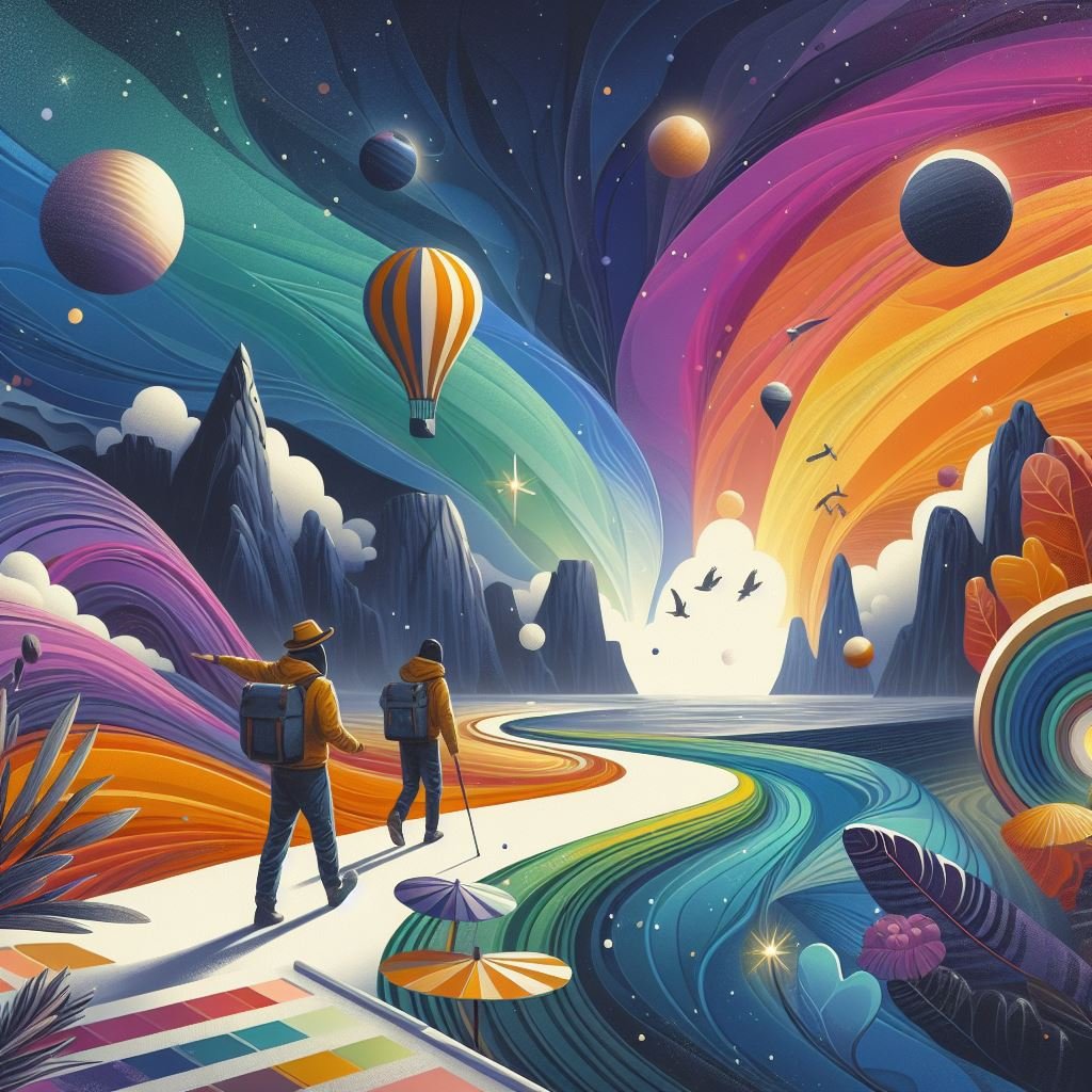
Every shade tells a story, whispering emotional undertones and shaping perceptions. That fiery red isn't just a bold choice; it's a declaration of passion, energy, and innovation. The serene blue isn't merely calming; it's a beacon of trust, stability, and reliability. Understanding these intrinsic meanings allows us to craft a color palette that sings in perfect harmony with our brand's soul.
So, buckle up, fellow explorers, as we delve into the vibrant spectrum of brand identity:
Warm Warriors:
Red: The ultimate power player, red exudes passion, excitement, and confidence. Think Nike's bold swoosh, Coca-Cola's iconic can, or Netflix's captivating logo. Use it sparingly, for too much red can overwhelm and trigger aggression.
Orange: Bursting with optimism and creativity, orange radiates warmth, enthusiasm, and playfulness. Fanta's citrusy hue, Nickelodeon's playful splatters, and Amazon's energetic smile all embrace the infectious spirit of orange.
Yellow: Radiating happiness, optimism, and intellect, yellow sparks curiosity and inspires action. IKEA's cheerful yellow, McDonald's playful fries, and Post-it's iconic notepads all tap into the sunny energy of this sunshine hue.
Cool Companions:
Blue: The epitome of trust, security, and peace, blue inspires confidence and promotes calming focus. Think of Ford's reassuring blue oval, Skype's calming video calls, and Facebook's familiar platform, all grounded in the serenity of blue.
Green: Embracing growth, harmony, and balance, green evokes feelings of nature, health, and well-being. Starbucks' verdant siren, Spotify's lush playlists, and Whole Foods' organic aisles all resonate with the nurturing spirit of green.
Purple: A blend of regal red and calming blue, purple represents luxury, mystery, and creativity. Cadbury's indulgent chocolates, YouTube's visionary platform, and Hallmark's heartfelt greetings all tap into the enigmatic allure of purple.
Neutral Navigators:
Black: Sophisticated and timeless, black exudes elegance, power, and mystery. Chanel's little black dress, Adidas' classic stripes, and Tesla's sleek cars all embrace the understated grandeur of black.
White: Conveying purity, simplicity, and new beginnings, white offers a clean canvas for creativity and innovation. Apple's minimalist design, Dove's commitment to clean beauty, and The New York Times' crisp headlines all leverage the versatility of white.
Remember, this is just a glimpse into the rainbow of possibilities. Every brand's story is unique, and its color palette should reflect that individuality. Use these hues as guiding stars, not rigid formulas. Experiment, blend, and play, letting your intuition guide your brushstrokes.
As you embark on this color exploration quest, keep these tips in mind:
Consider your brand's core values: What are the fundamental beliefs that drive your brand? What feelings do you want to evoke in your audience? Align your color choices with these core principles.
Know your target audience: Understanding your ideal customer's cultural and emotional context is crucial. Research the colors that resonate with their sensibilities and avoid those that might carry negative connotations.
Seek inspiration: Look beyond design trends and delve into the world around you. Nature, art, music, and even childhood memories can spark unexpected color connections.
Don't be afraid to experiment: Play with shades, tones, and unexpected combinations. Create mood boards, mockups, and visual prototypes to see how your color palette comes to life.
Ultimately, your brand's color story is a living tapestry woven with meaning and emotion. It's not just about picking a pretty palette; it's about expressing your unique identity and fostering a connection with your audience. So, embrace the vibrant spectrum within, and let your colors sing!